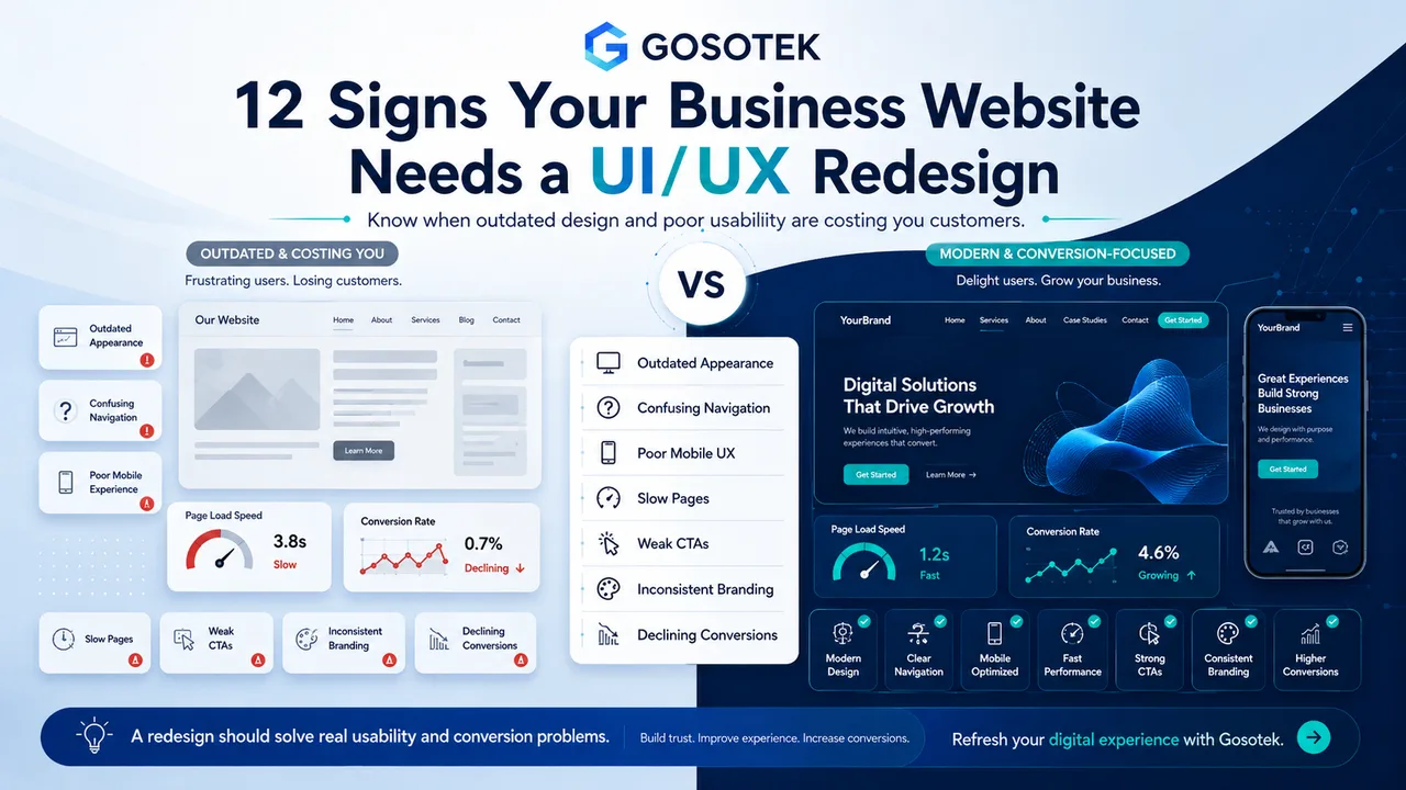
A website rarely fails overnight. Results usually decline through smaller problems: visitors cannot find information, mobile pages feel awkward, forms create friction or the design no longer reflects the business.
A UI/UX redesign should address measurable usability, communication and conversion problems—not personal preference. Here are 12 warning signs.
1. The Website Looks Outdated
Old typography, crowded layouts and dated graphics can make an active business appear neglected. Modernize without copying short-lived trends.
2. Navigation Is Confusing
Visitors should quickly find services, products, pricing and contact details. Repeated labels, hidden pages or too many menu choices increase effort.
3. Mobile Usability Is Poor
Users should not need to zoom, scroll sideways or tap tiny controls. Mobile design must reprioritize content and actions, not merely shrink the desktop layout.
4. Pages Load Slowly
Large images, unnecessary scripts and heavy animation delay interaction. Speed is a UX issue because customers experience every delay directly.
5. Calls to Action Are Weak
Buttons such as “Submit” or “Learn More” may not explain the value. Use specific actions such as “Request a Website Estimate.”
6. Branding Is Inconsistent
Different colours, button styles, imagery and writing tones make the site feel fragmented. A design system creates consistency.
7. Visitors Are Not Converting
Traffic without enquiries, purchases or registrations may indicate unclear value, poor CTA placement or a complicated journey. Review analytics before assuming the cause.
8. Content Is Difficult to Scan
Long paragraphs, weak headings and crowded sections hide important benefits. Clear hierarchy helps visitors understand the offer quickly.
9. Forms Are Frustrating
Unnecessary fields, vague labels and poor error messages cause abandonment. Ask only for information needed at that stage.
10. Customers Ask Basic Questions
Repeated calls about services, delivery, pricing or process may show that essential website information is unclear.
11. The Website Is Difficult to Update
Rigid layouts and inconsistent components make every change expensive. A redesign should improve the internal publishing workflow too.
12. The Site No Longer Supports Business Goals
A website built for five services may not suit a company serving multiple industries, locations or customer types. Its structure must evolve with the business.
Redesign or Refresh?
A visual refresh changes styling while preserving most of the structure. A UI/UX redesign reviews navigation, content hierarchy, customer journeys, interactions and page templates.
Match the scope to the actual problem.
Common Redesign Mistakes
Do not begin without analytics, customer feedback and success measures. Avoid changing familiar navigation only to appear creative. Never launch attractive screens without testing key journeys on real devices.
Gosotek identifies friction before producing final visuals, keeping redesign decisions connected to customer behaviour and business outcomes.
Frequently Asked Questions
How often should a website be redesigned?
There is no fixed schedule. Redesign when evidence shows usability, brand, technology or business-goal problems.
Will a redesign improve conversions?
It can, provided the project fixes the correct issues and includes content improvement and testing.
Can we retain existing content?
Yes, but unclear or outdated content may limit the redesign. Review content and layout together.
Should SEO be considered?
Yes. Preserve valuable URLs, plan redirects and review headings, metadata, internal links and performance.
How long does a redesign take?
It depends on website size, research depth, content readiness, integrations and approval cycles.
Conclusion
A redesign is justified when the website creates friction, weakens trust or no longer supports business priorities. Begin with diagnosis, not decoration.