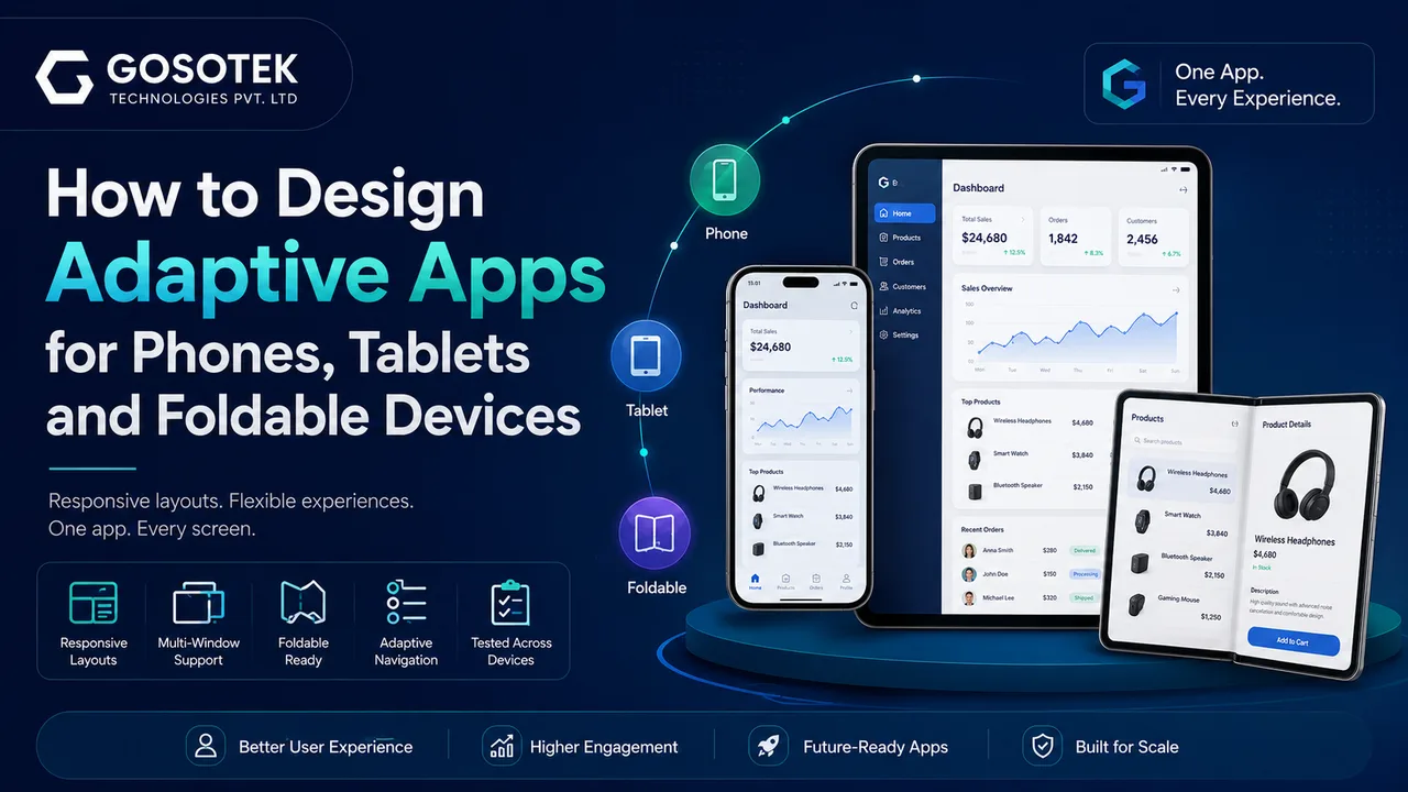
An app should not feel stretched on a tablet, cramped in split-screen mode or awkward when a foldable opens. Yet many products still treat a bigger screen as an oversized phone.
Android recommends designing around the app’s available window, not simply the device name. The same app may run full-screen, beside another app or across folded and unfolded states.
Responsive and Adaptive Layouts
Responsive layouts resize and reposition elements as space changes. Adaptive layouts go further by switching to a structure better suited to the current window.
A retail ordering app may show one product list on a phone, a list with product details on a tablet, and persistent navigation with a visible cart on a wider display.
The goal is to reduce taps and make information easier to access.
Use Window Sizes, Not Device Labels
“Phone,” “tablet” and “foldable” are unreliable layout rules. A tablet in split-screen mode may offer less width than an unfolded foldable.
Android recommends window size classes as breakpoints for top-level layout decisions. The interface should adapt whenever the window is resized, rotated, folded or moved into multi-window mode.
| Window space | Suitable experience |
|---|---|
| Compact | Single-column content and bottom navigation |
| Medium | Wider content, navigation rail or selected two-pane layouts |
| Expanded | Multi-pane content and persistent navigation |
Adapt Navigation and Preserve Context
Bottom navigation suits compact screens. Medium layouts may use a navigation rail, while expanded layouts can support a permanent drawer.
Layout changes must preserve context. Rotating or unfolding a device should not clear a form, lose the selected item or return the user to the home screen. Android’s guidance emphasizes continuity during configuration changes.
Plan for Multi-Window Usage
Apps may run in split-screen, picture-in-picture or movable, resizable windows.
Test whether text remains readable, controls stay reachable, dialogs fit, keyboards do not hide important actions and ongoing tasks continue while the window is resized.
Design Useful Foldable Experiences
Foldables can shift quickly between compact, medium and expanded sizes. Hinges and device postures may also affect content placement.
A shopping app could show products on one side and the cart on the other when unfolded. A video app could place playback above the fold and controls below in tabletop mode. These changes should improve the task, not become visual gimmicks.
Common Mistakes
Common problems include enlarging a phone layout without restructuring it, fixed portrait orientation, stretched cards, excessive empty space, phone-only navigation, lost state after resizing and limited testing.
The Gosotek Perspective
At Gosotek, adaptive app design begins with user journeys. We identify what users need to accomplish, decide how content priority changes with available space and define compact, medium and expanded experiences.
This creates an app that feels intentional across devices without building completely separate products.
Conclusion
Adaptive design is not simply tablet support. Apps must handle changing windows, multitasking, orientation changes and foldable states without interrupting users.
A strong adaptive interface uses the screen effectively.
Request an adaptive-app design assessment from Gosotek to review your layouts, navigation, resizing behaviour and large-screen readiness.
FAQs
- Can one layout work on every device?
A shared foundation can work, but structural changes are often needed at different window sizes.
- Does adaptive design increase cost?
It adds planning and testing, but addressing adaptability early is usually more efficient than rebuilding later.
- Should every tablet screen use multiple panes?
No. Use them only when related content benefits from appearing together.
- How should a foldable app handle the hinge?
Keep important content away from folds or obstructed areas and respond to device posture.
- How should adaptive apps be tested?
Test multiple window sizes, orientations, split-screen setups, resizable windows and folded and unfolded states.